Why small design adjustments matter for your business
For busy small business owners — plumbers, electricians, landscapers, and other home-service pros — every website visit is a potential job. A high bounce rate means visitors leave before they contact you. The good news: you don’t need a full redesign to improve engagement. Simple, targeted design tweaks can create a clearer path from a visitor landing on your page to them calling, filling out a form, or booking a job.
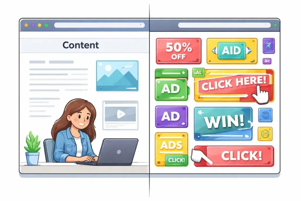
What is bounce rate and why it matters
“Bounce rate” is the percentage of single-page sessions where a visitor leaves without interacting further. While it’s not the only metric that matters, a high bounce rate often signals problems with page speed, usability, content clarity, or mobile experience. Lowering bounce rate typically improves conversion rate and overall site performance.
Five practical design tweaks that reduce bounce rate
- Speed up page load time: Visitors expect pages to load quickly. Studies show most people will leave if a page takes more than a few seconds. Fixes include optimizing images (serve scaled, compressed images), enabling browser caching, and using a reliable hosting provider. For many small businesses, switching to a faster hosting plan or enabling image compression plugins produces immediate gains.
- Prioritize mobile-first design: More than half of searches for local services come from mobile devices. Ensure your site is mobile-friendly: readable text without zooming, touch-friendly buttons, and a layout that stacks content sensibly. Test pages on multiple phones and use Google’s Mobile-Friendly Test to spot issues.
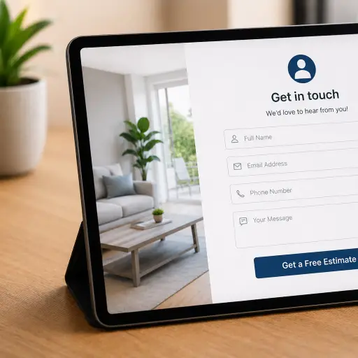
- Make your call-to-action crystal clear: Visitors should immediately know what action to take. Use a prominent, contrasting CTA button like “Call Now” or “Request an Estimate.” Place primary CTAs above the fold and repeat them in logical places. Use short, action-oriented labels and limit choices to reduce decision fatigue.
- Simplify navigation and reduce clutter: A confusing menu or too many visuals distract visitors. Limit your top navigation to the essentials: Services, About, Reviews, Contact. On service pages, use clear headings, bullet lists, and short paragraphs so customers quickly find what they need.
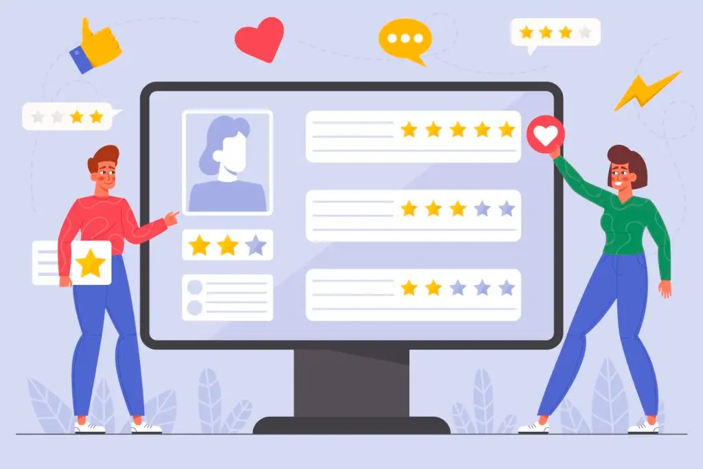
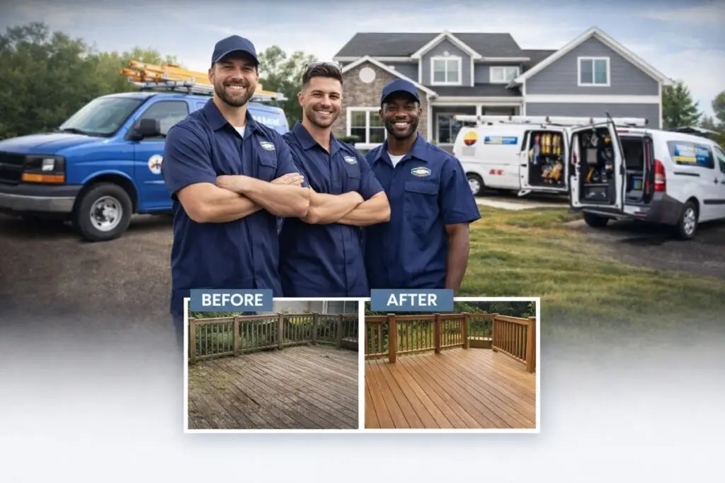
- Improve visual hierarchy and trust signals: Good design guides the eye. Use size, color, and spacing to highlight important information. Add trust signals where they matter: customer reviews, badges, and a short list of service guarantees. For blue-collar customers, a clear phone number and photos of real work build confidence fast.
Helpful UX and content practices
- Write scannable content: Use clear headings, bullets, and short sentences. Your ideal customer is likely on a job site or truck; make it easy to scan.
- Use descriptive headings: Instead of “Services,” try “Heating Repair & AC Service” so searchers and users know they’re in the right place.
- Limit pop-ups: Aggressive pop-ups can spike bounce rate. If you use them, delay appearance or trigger them on exit intent only.
- Offer one primary action per page: Too many competing CTAs dilute results. Make the main action obvious.
Tools and quick checks
Use a few easy tools to diagnose problems:
- Google PageSpeed Insights — for performance and speed fixes.
- Mobile-Friendly Test — to confirm mobile usability.
- Hotjar or simple heatmaps — to see where users click and scroll.
- Google Analytics — to measure bounce rate by page and track improvements.
How to test changes without guesswork
Make small, measurable changes and track the result. Run A/B tests where possible: change a CTA color, shorten a headline, or move a phone number and compare engagement metrics. If you don’t have the traffic for formal A/B testing, publish a change and monitor bounce rate, time on page, and contact form submissions for a few weeks. Keep a log so you can attribute improvements to specific tweaks.
Quick fixes you can implement this week
- Compress the three largest images on your homepage.
- Place a clear “Call Now” button in the header on mobile.
- Reduce your top navigation to four or five items.
- Add one strong customer review near the top of a service page.
- Ensure your phone number is clickable on mobile devices.
When to call in an expert
If you make basic improvements and still see a high bounce rate, or if your site is slow despite hosting and image fixes, it may be time to work with a web professional. A designer or developer can audit your site for deeper issues like heavy scripts, poor template structure, or inefficient code that affects performance and user experience.
Why Boise WEB cares about your bounce rate
At Boise WEB, we help small businesses get real results online. We know you don’t have time for a complicated website debate — you need customers. Our approach is professional, affordable, and focused on practical fixes that move the needle. We’ll prioritize changes that improve user experience, speed up your site, and make it easier for customers to contact you.
Reducing bounce rate isn’t just a metric exercise — it’s about making your website a useful, welcoming place for the people who need your services. Small design tweaks, applied thoughtfully, translate into more calls, more bookings, and more steady work.
Ready to reduce bounce rate? Contact Boise WEB today.