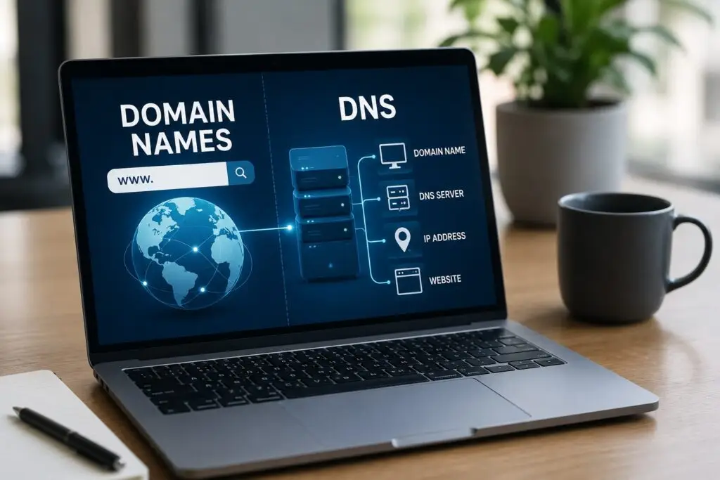
If you run a small business, your domain name and the Domain Name System (DNS) are more important than you
Every interaction on your website is an opportunity to convert a visitor into a lead or a customer. For small
For many Boise startups—especially trades and home service businesses—getting visible online is one of the fastest ways to attract customers.
Every business wants more traffic, leads, and customers from their website, but many Boise small business owners ask the same
Working with a local web design agency can be a game changer for small businesses, especially trades and home-service companies
For small, local businesses, especially trades and home-service companies, online reviews often matter more than fancy website layouts. Reviews are
Local search drives customers to trades and home service businesses. When a homeowner searches “Boise plumber” or “AC repair near
For small business owners in trades, home services, and other blue-collar industries, time and budget are precious. Marketing channels come
For small business owners, especially trades and home service providers, budget matters. But when a cheap website seems like the
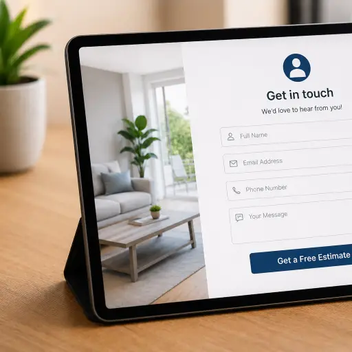
Small business owners, especially in trades and home services, often worry that asking for contact information will seem too aggressive.
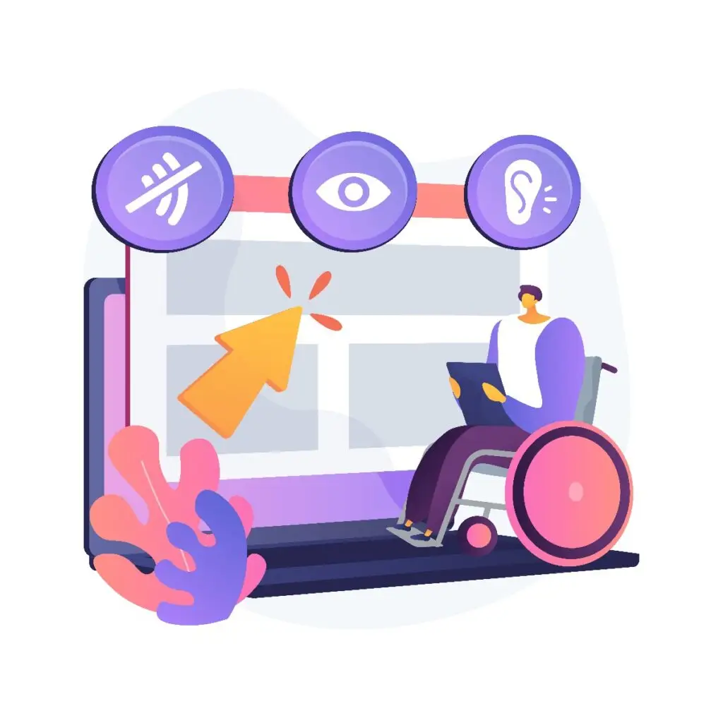
Website accessibility means designing and building web content so people with a wide range of abilities and disabilities can perceive,
When customers in Boise search for a plumber, electrician, or landscaper, Google prioritizes results that match the searcher’s location and
Get inspired and motivated! Please let us know if we can assist you with anything. We’d love to answer your questions.
Every build includes reliable, managed WordPress hosting.
You can upgrade or change your hosting plan at any time.
Professional-grade hosting, speed, and protection — without lifting a finger.
Hosting and a designer on call. Includes 1 hour of monthly site support.
Full hosting plus active SEO to grow your online presence.