
Small business owners, especially in trades and home services, often worry that asking for contact information will seem too aggressive. The truth is that the best CTAs don’t shout; they guide. A subtle, strategic CTA supports the user journey, clarifies the next step, and highlights a clear benefit. That combination improves conversion rates while preserving a professional, approachable tone.
What a CTA Really Does
A call-to-action is a prompt that encourages a visitor to take a specific action: request a quote, call, schedule an appointment, or download a guide. Good CTAs reduce uncertainty by telling users exactly what will happen next and why it’s worth their time. They are a core element of conversion rate optimization (CRO) and effective user experience (UX) design.
Why Subtle CTAs Work Better for Small Businesses
Subtle CTAs respect the visitor’s time and build trust. For blue-collar customers—plumbers, electricians, landscapers—people want fast clarity and reassurance. A soft CTA that emphasizes value (“Get a free estimate”) is often more effective than an urgent or aggressive ask. Subtle CTAs align with your brand voice: professional, helpful, and reliable.
Practical Strategies for Non-Pushy CTAs
- Lead with value: Explain the benefit before the button. Use microcopy to answer “what’s in it for me?” (e.g., “Free on-site estimate — no obligation”).
- Use single primary actions: Each page should have one primary CTA to reduce decision friction. Secondary CTAs can exist but should be visually lower priority.
- Offer micro-commitments: Ask for a small step first (like downloading a checklist or calling for a 30-second consultation), then follow up for a bigger ask.
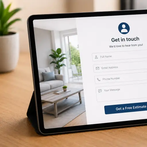
- Minimize form fields: Short forms increase completion rates. Only ask for essentials: name, phone or email, and brief project details. Consider progressive profiling for future data collection.
- Craft clear button copy: Replace vague “Submit” with benefit-focused text: “Get My Free Quote,” “Book a Service Visit,” or “See Pricing.”
- Place CTAs contextually: Match the CTA to the content. A service page should offer scheduling or estimate requests; a blog post might offer a how-to download or newsletter signup.
- Use trust signals nearby: Add short testimonials, review star ratings, or a “Licensed & Insured” note close to the CTA to reduce hesitation.
- Design for clarity: Use contrast and whitespace to make the CTA visible without being intrusive. Mobile-first design is crucial: most customers search and call from phones.
Examples for Trades and Home Services
Context matters. Here are a few low-pressure CTAs that work well for local service businesses:
- “Get a Free On-Site Estimate” — appeals to people wanting precise pricing.
- “Schedule a Same-Day Call” — for emergency or time-sensitive needs, framed as helpful.
- “Download Our Home Maintenance Checklist” — a micro-commitment useful for lead capture.
- “See Recent Jobs in Boise” — uses social proof to build credibility before asking for contact.
Measure and Improve
Testing is essential. Use A/B testing to compare button text, placement, colors, and form length. Track metrics like click-through rate, form completion rate, bounce rate, and phone call conversions. Tools like Google Analytics, heatmaps, and session recordings help identify friction points. Small changes (like swapping “Get a Quote” for “Get My Free Quote”) can lift conversions without changing the tone.
Common Mistakes to Avoid
- Too many competing CTAs that confuse visitors.
- Vague language that hides the outcome of clicking the button.
- Long forms that demand unnecessary information up front.
- Placing CTAs where users don’t expect them, such as hidden behind cluttered navigation.
Quick CTA Checklist
- Is the benefit stated clearly?
- Is there one clear primary action per page?
- Is the form as short as possible?
- Are trust signals near the CTA?
- Is the CTA tested and measured regularly?
When CTAs are crafted with clarity, context, and customer needs in mind, they stop being interruptions and start being helpful signposts that guide visitors toward becoming leads.
Conclusion
Non-pushy CTAs combine clear value, low friction, and trust-building cues to gently guide visitors into taking the next step. For small businesses in trades and home services, these subtle prompts deliver better lead quality and higher conversion rates while preserving a professional, approachable brand voice.
Want CTAs that convert without being pushy? Boise WEB specializes in affordable, professional web design and local SEO for small businesses. Schedule a free consultation to get a tailored CTA strategy and website improvements that turn visitors into reliable leads.