Every interaction on your website is an opportunity to convert a visitor into a lead or a customer. For small businesses in trades and home services, two conversions matter most: a completed contact form and a phone call. Both rely on the same foundation—user experience (UX). When forms, phone calls, and UX are aligned, you create a smooth path that increases trust, lowers bounce rates, and improves your conversion rate.
Why UX is the foundation
UX is the sum of everything a visitor experiences on your site: layout, load speed, content clarity, navigation, and accessibility. If the core experience is poor, no form or phone button will save you. Good UX reduces cognitive load, helps users find what they need quickly, and signals credibility—critical for service businesses where trust is essential.
Designing forms that actually convert
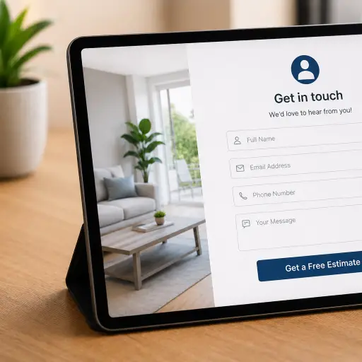
Forms are the primary lead-capture mechanism for many small businesses. To make forms effective:
- Keep fields minimal. Ask only for what you need. Name, phone, email, and a short message are often enough for initial contact.
- Use clear labels and inline validation. Let users know immediately if they made an error to prevent frustration and abandonment.
- Add helpful microcopy. A short line under a field can explain why you need certain information and reduce hesitation.
- Optimize button text. Replace generic “Submit” with action-driven text like “Request a Quote” or “Schedule a Call.”
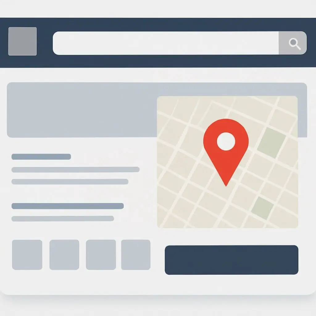
- Show trust signals near the form. Reviews, guarantees, and associations reduce uncertainty and increase form completion rates.
Making phone calls easy and valuable
Phone calls are high-intent conversions. Many customers prefer speaking with a real person for service quotes or scheduling. To make calls a reliable conversion channel:
- Use click-to-call buttons on mobile and a visible phone number in the header on desktop.
- Display clear hours so callers know when someone will pick up.
- Use call tracking to measure which pages and campaigns drive phone calls.
- Train staff to treat website callers as high-value leads. A consistent script improves conversion from call to booked job.
How forms and calls work together
Not every visitor is ready to call; some prefer forms. Offer both and let the UX guide the choice. For example, a landing page can present a short form as the primary option and a “Prefer to talk? Call us now” link as a secondary choice. This reduces friction and captures leads across preferences.
Mobile-first considerations
Most local searches and emergency service needs happen on mobile. Mobile UX changes priorities:
- Prominent click-to-call buttons should be sticky or in the header.
- Forms should use mobile-friendly input types (tel, email) and avoid long multi-step forms.
- Ensure fast load times and responsive layouts so callers and form-fillers don’t abandon due to slow pages.
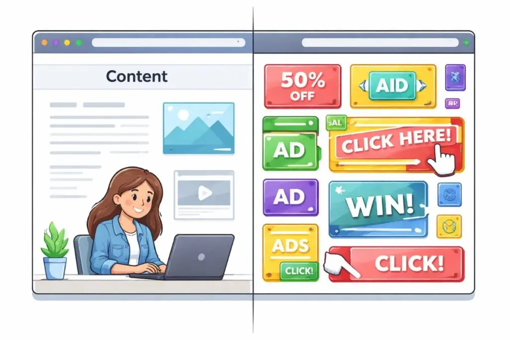
Reducing friction and building trust
Friction is anything that interrupts the path to conversion. Common sources include too many required fields, confusing navigation, or lack of social proof. Reduce friction with:
- Progress indicators for multi-step forms.
- Auto-fill and saved state so users don’t have to re-enter information.
- Clear pricing ranges or example quotes when possible to set expectations.
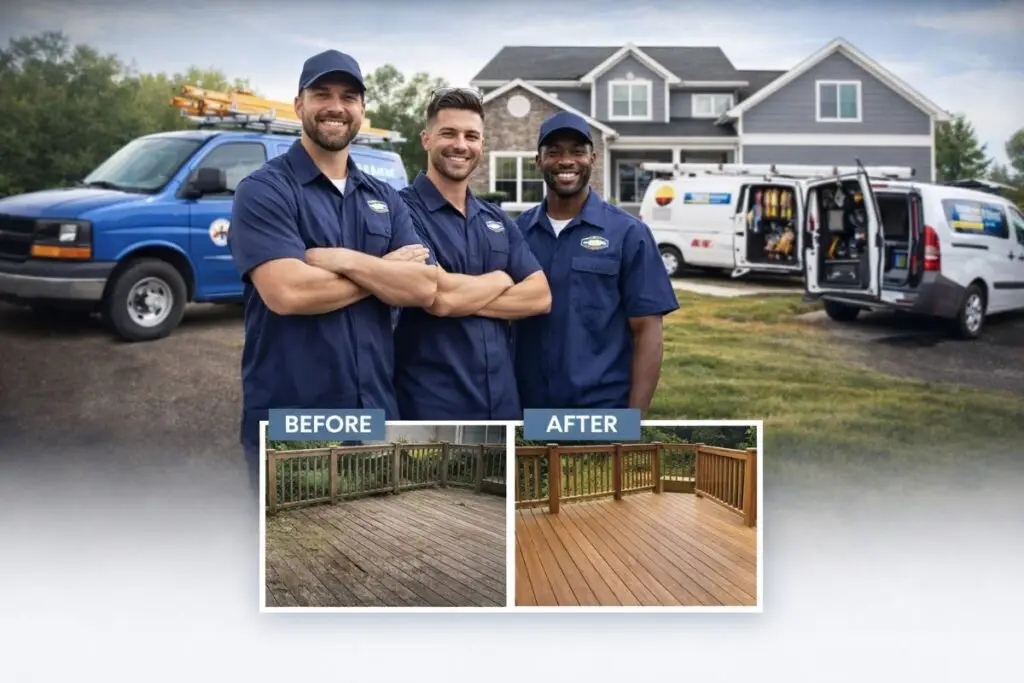
- Visible reviews, badges, and before/after photos to increase credibility.
Measure and iterate
Conversion optimization is an ongoing process. Key metrics include form completion rate, phone call volume, call-to-booking rate, bounce rate, and time on page. Use A/B testing to try variations—shorter forms, different CTA text, alternate form placement, or a prominent phone button—and compare results. Call tracking and analytics give you the quantitative data to prioritize improvements.
Simple tests to start with
- Test a one-step form vs. a two-step form and compare completion rates.
- Swap “Submit” for a specific CTA like “Get a Free Estimate” and measure clicks.
- Add a click-to-call button on mobile and track the increase in call volume.
- Place trust badges near the form and test form conversion lift.
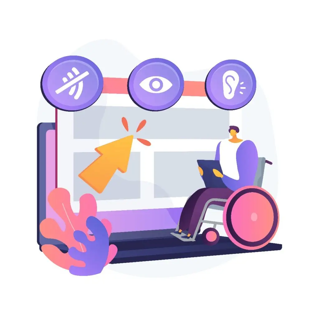
Accessibility and legal considerations
Make sure forms are accessible to screen readers and follow privacy rules: provide a clear privacy notice and, if required, a checkbox for consent. Accessibility widens your audience and reduces legal risk.
Conclusion
Forms, phone calls, and UX are not separate tactics; they are parts of one conversion system. Prioritize a fast, clear UX, minimize form friction, and make calling effortless. Together these elements create multiple paths to conversion that match how real customers prefer to interact with your business.
If you run a small trades or home services business and want a website that converts, Boise WEB can help. We design responsive sites, optimize forms, implement call tracking, and improve UX so your site turns more visitors into customers. Contact Boise WEB to schedule a free consultation and start converting more leads today.