
For small businesses in trades and home services, most customers start their search on a smartphone. Mobile-first design means building your website and online experience starting with the needs of mobile users, then scaling up for larger screens. It is not just a technical trend — it directly affects search rankings, user experience, and your ability to capture leads when potential customers are ready to hire.
What “mobile-first” actually means
Mobile-first design is an approach where the layout, navigation, and content are optimized for mobile devices first. Key concepts include:
- Responsive design – pages adapt to various screen sizes so content remains readable and usable.
- Performance optimization – fast load times and efficient code to reduce friction on slower mobile networks.
- Touch-friendly interactions – large buttons, simple menus, and click-to-call actions that match mobile behaviors.
- Prioritized content – present the most important information (services, contact methods, reviews) up front.
Why it matters for trades and home services
Customers searching for plumbers, electricians, HVAC technicians, or landscapers are often on mobile and ready to act. Mobile-first design helps you:
- Increase conversion rates: A clear, fast mobile site makes it easier for prospects to call, book, or request a quote.
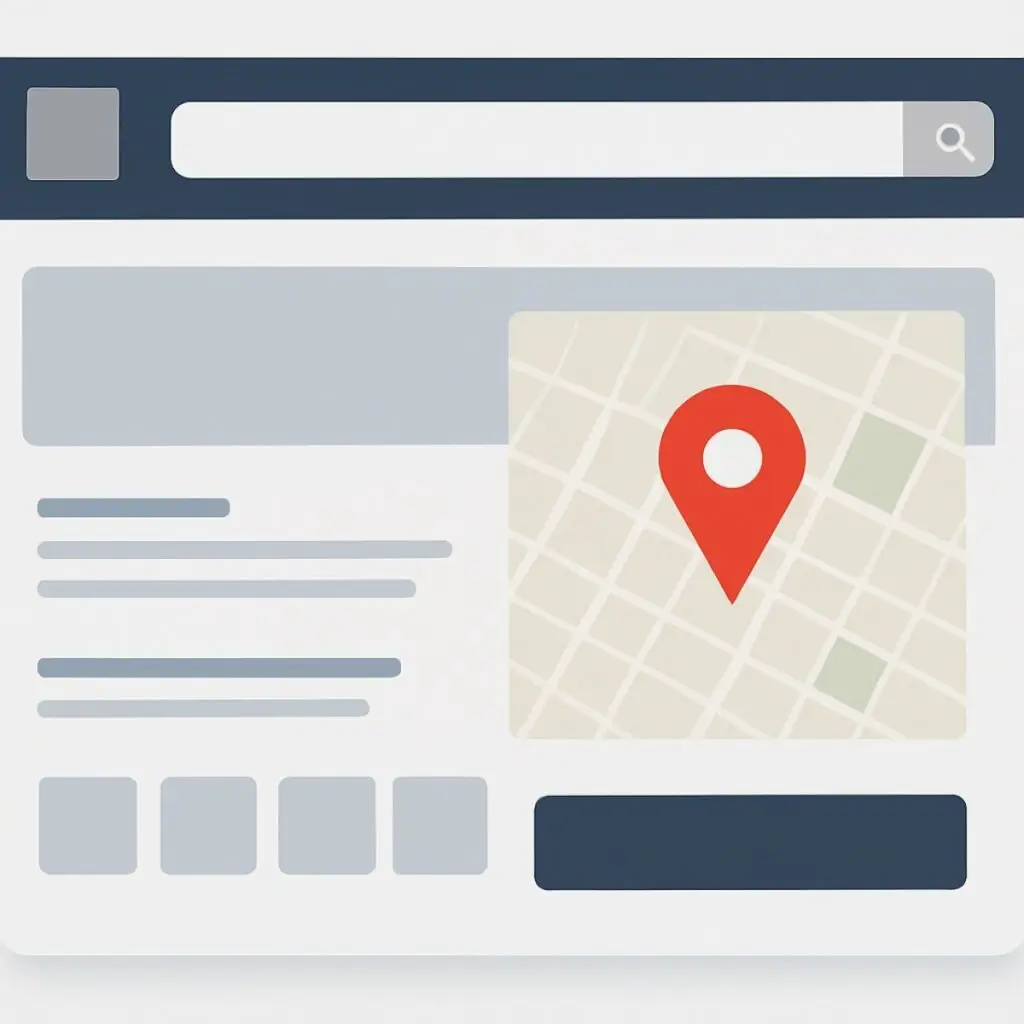
- Improve local search visibility: Google uses mobile-first indexing, so a poor mobile experience can hurt your rankings in local pack and map results.
- Reduce bounce rates: Slow or cluttered mobile pages drive visitors away before they contact you.
- Build trust quickly: Prominent reviews, credentials, and service areas reassure customers who need jobs done now.
How mobile-first affects SEO and Google rankings
Google predominantly uses the mobile version of a site for indexing and ranking. If your mobile pages are missing content, slow, or poorly structured, your organic visibility can suffer. Mobile-first design also ties directly into elements that influence local SEO:
- Page speed and Core Web Vitals
- Structured data for business details and services
- Mobile-friendly popups and navigation that do not block content
Practical elements to implement now
Start with these changes to make your site mobile-first and lead-ready.
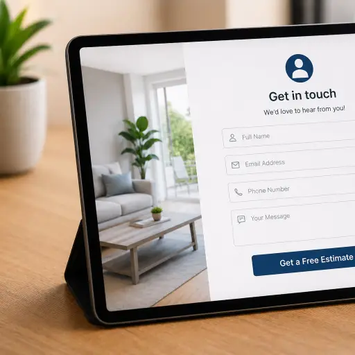
- Prioritize contact actions: Place a click-to-call button and a short contact form in the header or top of each service page.
- Simplify navigation: Use clear menus with service categories and a visible service area. Avoid deep dropdowns on mobile.
- Speed up pages: Compress images, enable browser caching, and minimize third-party scripts. Fast load times increase conversions.
- Use readable fonts and CTA sizing: Increase font size for body text and ensure buttons are easy to tap.
- Show local proof: Add prominent reviews, license badges, and neighborhood pages so prospects see you serve their area.
- Optimize forms for mobile: Only ask for essential information. Use phone-friendly inputs and autofill options.
- Implement structured data: Use LocalBusiness schema to help search engines understand your services, hours, and service area.
- Test regularly: Use Google Mobile-Friendly Test and real device checks to confirm usability.
Simple content strategy for mobile users
Mobile visitors skim. Make content short, scannable, and action-oriented.
- Lead with the main service and a phone number.
- Use bullet lists for service highlights and pricing ranges.
- Include a clear next step: Call now, request a quote, or schedule an estimate.
- Use short testimonials with location cues to build trust fast.
Measuring success
Track mobile performance using:
- Google Analytics: Monitor mobile sessions, bounce rate, and conversion rate for calls and form submissions.
- Google Search Console: Check mobile usability reports and indexing status.
- Speed and UX tools: Lighthouse and PageSpeed Insights to measure Core Web Vitals.
Common pitfalls to avoid
- Hiding content: Don’t remove important content from mobile pages that exists on desktop; Google indexes mobile content first.
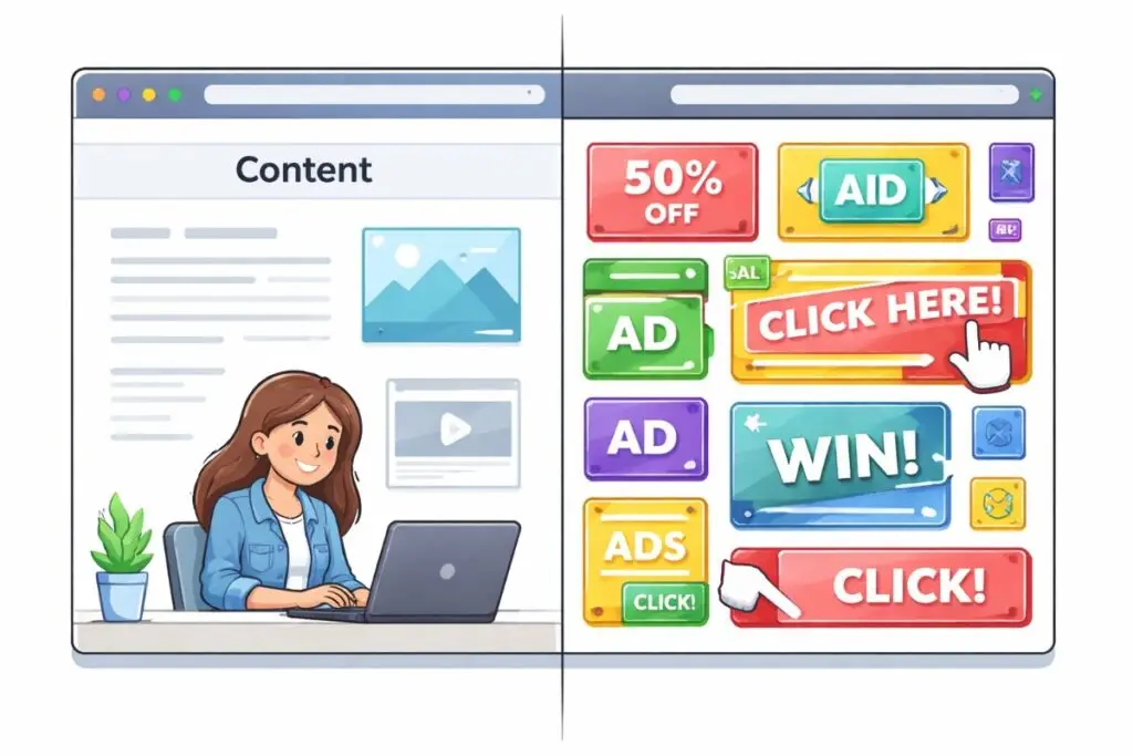
- Overcrowded CTAs: Too many popups or banners create friction; keep conversion paths simple.
- Poor click-to-call placement: Make calling immediate and obvious without forcing users to scroll.
A mobile-first checklist for trades and home services
- Header with phone number and click-to-call
- Fast loading homepage and service pages
- Simple, tap-friendly navigation
- Short mobile forms and clear CTAs
- Local proof: reviews, service areas, licenses
- Structured data and mobile-friendly images
- Regular testing on real devices
How Boise WEB helps
At Boise WEB we focus on practical, affordable web solutions for small business owners in trades and home services. Our team builds mobile-first websites that look professional, load fast, and convert visitors into calls and bookings. We combine local SEO, responsive design, and ongoing website management so you can focus on running your business while we help bring in customers.
Mobile-first design is not optional anymore — it is a business requirement. Prioritize the mobile experience, measure results, and iterate. Small improvements like a faster page or a clearer click-to-call can make a big difference in the number of leads you get each month.
Ready to get more calls? Contact Boise WEB for a mobile-first site audit today.


