
In today’s digital landscape, your website’s usability is critical to its success. Visitors expect a seamless and intuitive experience, and if your site is confusing or difficult to navigate, they’re likely to leave and never return. Creating an easy-to-navigate website involves thoughtful planning, user-centered design, and continuous refinement. This article provides a detailed guide on how to achieve a user-friendly navigation system for your website.
- Understanding the Importance of Website Navigation
- Principles of Effective Website Navigation
- Designing an Intuitive Navigation Menu
- Enhancing Navigation with Search Functionality
- Internal Linking and Breadcrumbs
- Testing and Refining Your Navigati
- Common Navigation Mistakes to Avoid
1. Understanding the Importance of Website Navigation
Website navigation refers to the system that helps users find information and explore your site. Good navigation is essential because:
- First Impressions Matter: Users often judge the credibility of a website based on its design, and navigation is a key part of that.
- Improved User Experience (UX): A well-structured navigation system helps users find what they’re looking for quickly, reducing frustration and improving their overall experience.
- SEO Benefits: Search engines like Google favor websites with clear, organized navigation structures, which can improve your ranking.
- Increased Conversions: A site that’s easy to navigate encourages users to explore more pages, engage with your content, and ultimately convert into customers.
2. Principles of Effective Website Navigation
Before diving into specific techniques, it’s important to understand the principles that underpin effective website navigation:
- Simplicity: Navigation should be simple and straightforward. Avoid cluttering your menu with too many options.
- Consistency: Keep the navigation structure consistent across all pages. Users should not have to re-learn how to navigate when they move from one page to another.
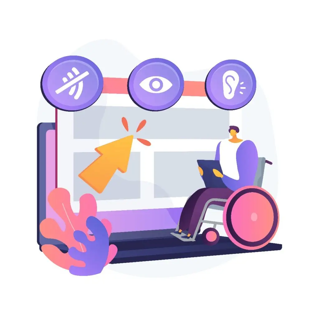
- Accessibility: Ensure that your navigation is accessible to all users, including those with disabilities. Use descriptive link texts and provide keyboard-friendly navigation.
- Visual Hierarchy: Organize your navigation elements in a way that prioritizes the most important sections of your site. This helps users focus on key areas.
3. Designing an Intuitive Navigation Menu
The navigation menu is the most visible part of your navigation system, and getting it right is crucial.
Structure Your Menu Logically
- Categorize Content: Group similar content under broad categories. For example, if you run an e-commerce site, group products under categories like “Men,” “Women,” “Kids,” etc.
- Limit Menu Items: Too many options can overwhelm users. Aim for 5-7 primary menu items.
- Use Submenus Wisely: If necessary, use dropdown menus or flyouts to further categorize content, but don’t overdo it. Too many nested layers can be confusing.
Clear and Descriptive Labels
- Use Familiar Terms: Avoid jargon or overly creative labels. Stick to terms that users will immediately understand.
- Descriptive Text: Ensure each label accurately describes the content it links to. For example, instead of “Our Services,” consider something more specific like “Web Design Services.”
Consider the Placement of Your Menu
- Top Navigation Bar: The most common placement is at the top of the page. This is where users typically look first.
- Sidebar Navigation: Useful for websites with a lot of content, such as blogs or news sites.
- Sticky Menus: These menus remain visible as users scroll down the page, ensuring easy access to navigation at all times.
Mobile Navigation
- Responsive Design: Ensure your navigation adapts to different screen sizes. On mobile devices, consider using a “hamburger” menu or a collapsible sidebar.
- Touch-Friendly: Make sure menu items are large enough to be tapped easily on a touchscreen.
4. Enhancing Navigation with Search Functionality
While a well-structured menu is essential, a search function can further improve your site’s navigability, especially for content-rich websites.
Implement a Search Bar
- Placement: Position the search bar prominently, usually at the top right of the page.
- Auto-Suggestions: Enhance the search experience by offering auto-suggestions as users type.
Optimize Search Results
- Relevance: Ensure that search results are relevant and prioritized based on user intent.
- Filters and Sorting: Allow users to refine their search results with filters and sorting options.
Search Analytics
- Track User Queries: Use analytics tools to monitor what users are searching for. This can provide insights into what content is most sought after and highlight gaps in your site’s navigation.
5. Internal Linking and Breadcrumbs
Internal linking and breadcrumbs are additional tools that enhance navigation by helping users understand their location on the site and explore related content.
Internal Linking
- Contextual Links: Within your content, link to other relevant pages on your site. This not only improves navigation but also boosts SEO.
- Call-to-Action (CTA) Links: Use links to guide users toward key actions, such as signing up for a newsletter or making a purchase.
Breadcrumb Navigation
- What Are Breadcrumbs? Breadcrumbs are a secondary navigation aid that shows users their path from the homepage to their current page.
- Benefits: Breadcrumbs help users understand the site’s structure, reduce the number of clicks needed to return to higher-level pages, and improve SEO.
- Implementation: Place breadcrumbs at the top of the page, just below the main navigation menu.
6. Testing and Refining Your Navigation
Even the best planned navigation needs to be tested and refined over time.
Usability Testing
- Conduct Tests with Real Users: Use tools like A/B testing or user testing sessions to observe how people interact with your site’s navigation.
- Collect Feedback: Encourage users to provide feedback on your site’s navigation. Use surveys or feedback forms to gather insights.
Analyze Behavior Analytics
- Use Heatmaps: Tools like heatmaps show where users are clicking and how they navigate through your site.
- Track User Flow: Analyze the paths users take from entry to exit. This can highlight any obstacles or confusing areas in your navigation.
Continuous Improvement
- Regular Updates: As your website grows and changes, so should your navigation. Regularly review and update your navigation to ensure it remains relevant and user-friendly.
- Stay Informed: Keep an eye on web design trends and emerging technologies that could enhance your site’s navigation.
7. Common Navigation Mistakes to Avoid
Finally, be aware of common mistakes that can undermine your efforts:
- Overloading the Menu: Don’t try to include everything in your main menu. Prioritize the most important pages.
- Hidden Navigation: Avoid hiding important navigation elements behind icons or within dropdowns. Keep primary navigation visible.
- Inconsistent Labels: Ensure that menu labels are consistent in wording and style across the site.
- Poor Mobile Experience: Don’t neglect mobile users. Test your navigation on different devices to ensure it works well on all screen sizes.
Conclusion
Creating an easy to navigate website is an ongoing process that requires attention to detail and a deep understanding of your users’ needs. By following the principles and best practices outlined in this guide, you can build a website that not only meets your business goals but also provides a seamless and enjoyable experience for your visitors. Remember, a well designed navigation system is the foundation of a successful website. Get it right and your users will thank you with their loyalty and engagement.


