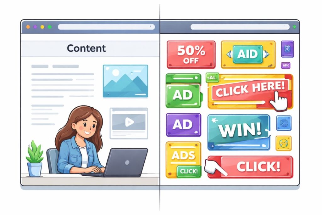
Color is one of the most powerful tools in the designer’s toolkit. It has the ability to evoke emotions, influence perceptions, and guide decision-making. In the realm of web design, where user experience and engagement are paramount, the strategic use of color can make the difference between a successful website and one that fails to connect with its audience. This article explores the fascinating world of color psychology and its profound impact on web design, delving into how different colors influence user behavior, how they can be used to enhance usability and accessibility, and how they contribute to brand identity.
Understanding Color Psychology
Color psychology is the study of how colors affect human behavior and emotions. It is based on the idea that colors can trigger specific psychological responses. While cultural factors and personal preferences play a role in how we perceive colors, there are some general trends in color psychology that are widely recognized.
For example:
- Red is often associated with energy, passion, and urgency. It can stimulate the appetite and is commonly used in call-to-action buttons.
- Blue conveys trust, calm, and professionalism. It is frequently used by financial institutions and healthcare providers.
- Green symbolizes nature, growth, and tranquility. It is commonly used for eco-friendly brands and wellness websites.
- Yellow evokes happiness, optimism, and warmth. It can grab attention but should be used sparingly as it can also cause visual fatigue.
- Purple is associated with luxury, creativity, and spirituality. It is often used by brands targeting a higher-end market.
- Black represents sophistication, elegance, and power. It is widely used in fashion and luxury goods.
- White signifies purity, simplicity, and cleanliness. It is often used in minimalist design and to create space in layouts.
Understanding these associations is crucial for web designers, as the choice of color can significantly impact the way users perceive and interact with a website.
The Role of Color in User Experience (UX)
The primary goal of web design is to create a positive user experience. Color plays a central role in achieving this by guiding the user’s attention, conveying information, and creating a cohesive visual hierarchy. Here’s how color can enhance UX:
1. Attention and Focus
Colors can be used to draw attention to specific elements on a page. For example, using a bold, contrasting color for call-to-action buttons ensures they stand out, making it easier for users to complete desired actions, such as signing up for a newsletter or making a purchase.
Similarly, highlighting important text with a different color can make it more noticeable, improving readability and comprehension.
2. Navigation
Consistent use of color can help users navigate a website more easily. For instance, using the same color for all clickable links or buttons creates a predictable and intuitive experience. Users quickly learn what to expect, reducing confusion and frustration.
Breadcrumbs, navigation menus, and hover effects also benefit from thoughtful color choices that provide clear visual cues to users.
3. Emotional Impact
The emotional response elicited by color can influence how users feel while interacting with a website. For example, a website designed for a spa or wellness center might use calming shades of green and blue to create a serene atmosphere, encouraging users to relax and explore the services offered.
On the other hand, a site promoting an urgent sale might use red to create a sense of urgency, prompting users to take immediate action.
4. Brand Identity and Consistency
Color is a fundamental aspect of brand identity. A well-chosen color palette can reinforce a brand’s message and values, making it instantly recognizable to users. For instance, Coca-Cola’s use of red and white has become synonymous with the brand itself, evoking feelings of excitement and refreshment.
Consistency in color usage across different web pages and marketing materials helps build trust and recognition. A cohesive color scheme ensures that every element of the website aligns with the brand’s identity, providing a seamless experience for the user.
Color and Accessibility
Accessibility is a critical consideration in web design, ensuring that websites are usable by everyone, including people with disabilities. Color plays a significant role in accessibility, particularly for individuals with visual impairments or color blindness. Web designers must be mindful of the following:
1. Contrast
Sufficient contrast between text and background colors is essential for readability. For users with low vision or color blindness, text with low contrast can be difficult or impossible to read. Designers should aim for a contrast ratio of at least 4.5:1 for normal text and 3:1 for large text to ensure accessibility.
2. Color Blindness
Approximately 8% of men and 0.5% of women have some form of color blindness, with red-green being the most common type. To accommodate these users, web designers should avoid relying solely on color to convey information. For example, instead of using red and green to indicate success and error states, designers can use icons or text labels in addition to color.
3. User Control
Some users may prefer or need to adjust color settings for better visibility. Providing options for high-contrast modes or allowing users to customize the color scheme can greatly enhance accessibility.
Color and Cultural Considerations
Color meanings can vary significantly across cultures, making it essential for web designers working on international or multicultural websites to consider these differences. For instance:
- White is often associated with purity and weddings in Western cultures but can symbolize mourning in some Asian cultures.
- Red is considered lucky in Chinese culture, often used in celebrations, but it can also signify danger or warning in other contexts.
- Yellow is a color of courage and nobility in Japan, while in some parts of Africa, it may be associated with wealth and status.
When designing for a global audience, it’s important to research and understand the cultural connotations of color to avoid miscommunication or offense.
Case Studies: Successful Use of Color in Web Design
Several well-known websites effectively leverage color psychology to create engaging user experiences. Let’s look at a few examples:
1. Dropbox
Dropbox’s website uses a predominantly blue and white color scheme, which aligns with its brand’s emphasis on trust, reliability, and simplicity. The use of blue fosters a sense of professionalism and calm, which is appropriate for a service that manages important files and data.
2. Airbnb
Airbnb’s website features a warm, inviting color palette with shades of pink, purple, and orange. These colors evoke feelings of comfort, friendliness, and adventure, which align with the brand’s message of connecting people and providing unique travel experiences.
3. Apple
Apple’s website utilizes a minimalist design with a predominantly white and gray color scheme. The use of white space emphasizes clarity and simplicity, reinforcing Apple’s brand values of innovation and sophistication. Occasional splashes of color are used to highlight new products or promotions, drawing the user’s attention without overwhelming them.
Practical Tips for Using Color in Web Design
1. Start with Your Brand
Your color choices should reflect your brand’s identity and values. Consider the emotions and associations you want to evoke in your audience and choose colors that align with these goals.
2. Use a Limited Color Palette
Too many colors can create a chaotic and confusing experience. Stick to a limited color palette that complements your brand and enhances usability. A common approach is to choose a primary color, a secondary color, and one or two accent colors.
3. Test for Accessibility
Always test your color choices for accessibility. Use online tools to check contrast ratios and simulate how your design will look to users with color blindness. Ensure that your website is usable by the widest possible audience.
4. Consider Cultural Context
If your website has an international audience, research the cultural significance of your color choices. Be mindful of how colors might be perceived differently in various regions.
5. Keep Up with Trends
While it’s important to stay true to your brand, keeping an eye on current design trends can help your website feel modern and relevant. However, use trends judiciously to avoid creating a design that will quickly become outdated.
Conclusion
Color psychology is a powerful tool in web design, influencing everything from user emotions and behavior to brand perception and usability. By understanding the psychological effects of different colors and applying this knowledge strategically, web designers can create websites that are not only visually appealing but also highly effective in engaging users and achieving business goals.
As the digital landscape continues to evolve, the importance of thoughtful, informed color choices in web design will only grow. Whether you’re designing a new website or refreshing an existing one, consider the impact of color on your audience and use it to create an experience that resonates, connects, and converts.


