Your website, particularly your home page, is often people’s first introduction to you and your business. As such it should be set up in a way that gives a good first impression and hopefully turns visitors into customers.
Your homepage should tell people who you are, what you’re offering, and how it can change your customer’s lives for the better.
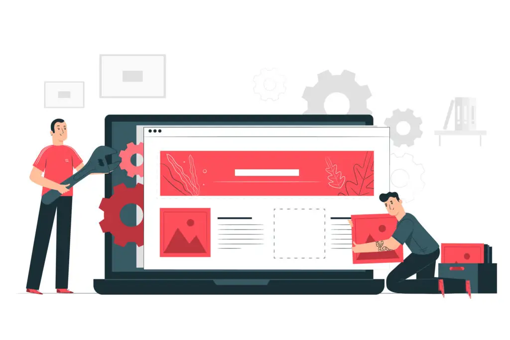
In this article we will be going over what elements you should include on your home page and how you should organize them to leave a great first impression and have your website be an asset to your business.
-
Header
-
Main Message
-
Benefit Banner
-
Testimonial Banner
-
Social Proof
-
The Offer
-
FAQs
-
Final Call to Action
-
Footer
The Parts of a Homepage
1. Header
Your header is the very top section of your page, usually staying consistent across most of the pages on your site.
This is typically the first place people look for additional information such as page menus, links to other relevant pages, contact buttons, and more.
Making your header useful for your visitors is crucial, but you can make it visually pleasing too!

2. Main Message
Your main message is the first message your visitors see when landing on your site.
It’s usually a short, powerful message of 4-12 words that encompasses who you are as a company and the main idea you want your viewers to know about your business.
This is your first impression, your first opportunity to make an impact, so make sure your message counts!

3. Benefit Banner
A benefit banner is a small section of your page that lists out 3-5 specific benefits of working with your company.
Highlight what makes you different, what pushes you ahead of the competition, and what you have to offer your customers.
Brag about what makes you special and unique so you can stand apart from the crowd.

4. Testimonial Banner
Your testimonial banner is exactly what it sounds like – it’s a section of your website that showcases testimonials and reviews from real customers.
This is your chance to dismantle any doubts your customers may have about the quality or effectiveness of your product, as well as boost credibility and trustworthiness of your brand.
Just make sure to use real customers and real reviews only, faking this section in an attempt to gain trust will have the opposite effect and your customers will no longer view you a credible business.
5. Social Proof
Social proof is another way to show your customers that you can be trusted and backed up.
You should obviously include your own social media links in this section, but it is also very helpful to include logos and links to any partner companies, brand deals, or high value customers with their permission.
This gives you additional social backing to show your customers that other people and brands trust your business, so they should too.
Linking your own social media platforms also acts as additional proof that your company is legitimate and not a scam.

6. The Offer
This is what you’re actually offering your customer. Whether it’s a product or a service, this is where you show off what you can give to your customers.
How is this going to benefit them? What problem will this solve? Why do they need this in their lives?
Present your customer with exactly what they would be getting, show them how it would benefit them, and explain why your offer is better than the competitor’s offer.
This is not the time to hide information, be fully transparent with your customers so that they can make informed decisions on which offer is best for them.
7. The Offer
Including the answers to frequently asked questions is a great way to address the most common concerns and doubts your customers may have about your product or your brand.
Address these concerns head on and provide your readers with real answers and solutions for their concerns.
Or, if you sell something that not everyone is knowledgeable about you can use this section to help educate future customers on exactly how your product works and why they can trust it.
In addition to answering questions about the product or service you offer, go over how the process works and show your visitors that it really is that easy.
8. Final Call to Action
It’s likely that you have call to action buttons placed throughout your webpage but having a final message as the last section of your page is crucial.
This is your last chance to convince your viewers to commit to that action, whether it be adding a product to their cart, clicking away to a different page in order to learn more, or filling out a basic information form.
Additionally, once getting to the bottom of your page it’s likely your viewers have already mostly made up their minds. For the potential customers that want to go further on your page, it’s crucial to have that option immediately available to them.
Nobody wants to have to scroll back up or search through the page to find the button they want, make it easily accessible to your viewers.
9. Footer
The footer on your website is likely the same across all web pages on your site.
Like your header, there may be a few isolated cases in which you’d want to simplify or minimize your footer in order to bring more focus to the rest of the page. In general, though, you’ll want to keep this consistent.
It should include your logo and company name and should be a comprehensive menu of all of the available pages on your site.
This is also a great place to put pages like your privacy policy, your about section, a careers page, and more that you may not want listed at the very top of the page but still want to make available to your viewers.

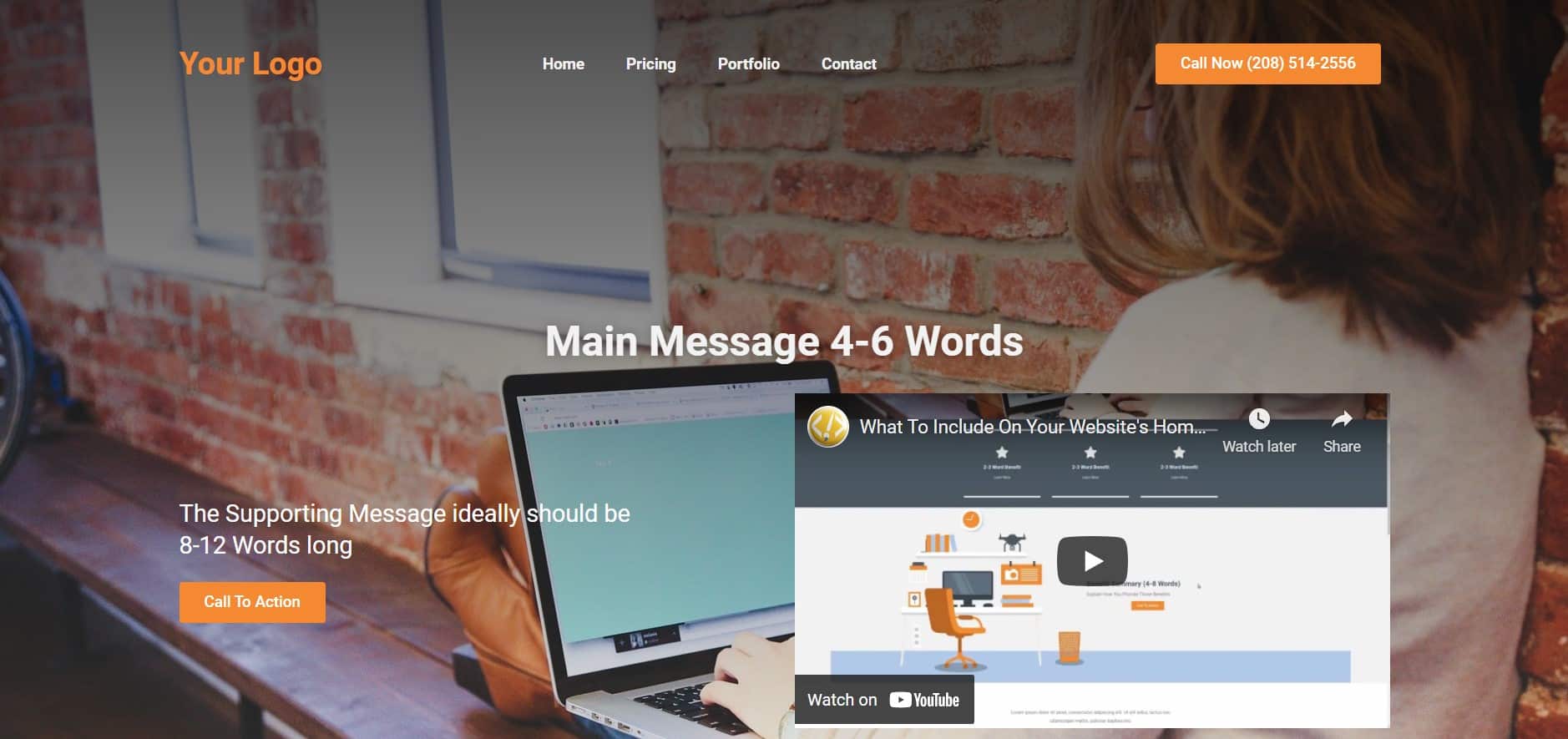
Elements that Should be Included in Your Header
1. Logo
Your logo should be placed at the very top of your homepage, usually within the header next to your navigational menu.
Your logo should be an icon and you should include the name of your business either within or next to your logo.
This logo represents who you are as a business and sets up your customer’s expectations for the general feel and experience they can expect from your business.
2. Navigation Links
Also at the very top of the screen within the header, you typically want to include a few of the most important or most popular navigation links on the page.
This allows your customers to easily navigate your site and get the most commonly asked questions answered as soon as possible.
If people have to search for information on your site, they aren’t likely to stick around.
In some cases, such as a specialized landing page, it makes sense to not include these navigational links in order to put a heavier emphasis on the main message at hand and push customers towards a conversion. However, on a homepage, these navigational links are absolutely essential.
3. Phone Number or Contact Button
The final thing that you should make sure is incorporated into your header is a phone number or a contact button that leads directly to an email or other immediate form of contact for your business.
This is incredibly important for visitors that come to your site and are ready to act right away.
You want to make sure they have the immediate option to contact you and don’t get lost on your site.
Elements that Should be Included in Your Main Message
1. Heading – Main Message
Your main message is likely to be the first thing that your viewers see. You want it to capture exactly what you’re offering to your potential customer.
In an ideal world this message would be just 4-6 words. You don’t want any filler in here, short and to the point is the way to go.
However, ideal situations don’t always happen and if you feel you need to include more in your main message it can be a maximum of 8-10 words.
Any more than that and your site won’t be viewed as positively for SEO purposes, so keep it simple!
2. Sub-Heading – Supporting Message
Your sub-heading, or supporting message, is used to elaborate on your main message and provide more information to your viewers.
This section should ideally be between 8-12 words and should be directly related to your main message. Like your main message, your supporting message can be slightly longer than this if needed to properly relay your message.
For example, your main message could be: “Custom Web Design Company in Boise Idaho”
With a supporting message of: “If you need a local company for Boise web design services, BOISE WEB is your answer”
3. Call to Action
Just below your main message and supporting message you want to insert your first call to action.
Some of the visitors to your site are going to be familiar with what you’re offering and will want to jump into the offer right away; don’t make them scroll down to find it.
Additionally, research has shown that providing a CTA button after each major section of information boosts interaction rates and makes viewers more likely to follow through on what it is that you’re asking them to do.
Your CTA buttons should all be relatively the same across your site. You could have “Learn More” in one section and “Add to Cart” in another, but in general you want to keep this consistent.
Have one main action that you want your customers to take and make sure all of your CTA buttons revolve around that goal.
4. Video (Optional)
Videos are not necessary to add to your site, but they can be a great visual tool to include on your homepage.
Additionally, if your video is interesting and intrigues viewers this is another great way to get potential customers to interact with and learn more about your brand.
However, if you don’t have a well-produced video available or don’t have a relevant topic it’s best to just leave this section out.
5. Background Image
If you think that your background image isn’t that important to the overall success of your home page, you couldn’t be more wrong.
While it may seem like a minor or glossed over detail, having a good background image can make or break your page.
People want websites to be visually interesting, but not busy.
Additionally, your background image should relate directly to the content on your page. For example, if you are trying to sell bicycles your background image could be of someone riding a bike, or of a group of individuals riding bikes together.
Your background image should add a level of visual interest and cohesion without taking away from your content or making it harder to read any of your material. If your chosen image is particularly bright you may need to darken the image or add an overlay in order to not distract from your message.
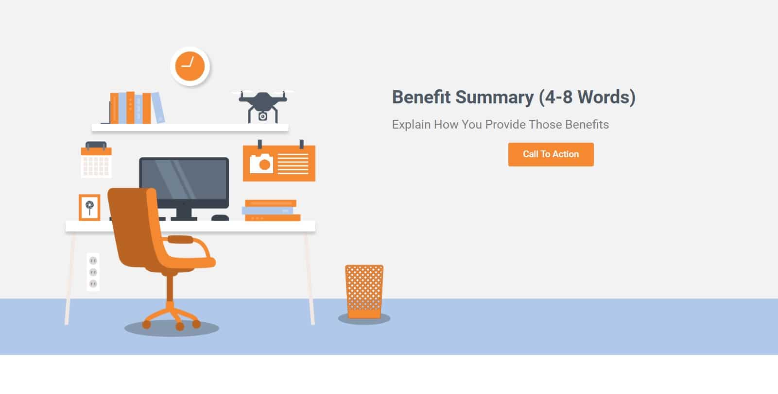
Elements that Should be Included in Your Benefit Banner
1. Benefit
This is your opportunity to set yourself apart from the competition.
What are you offering your customers that other businesses aren’t?
This could be an extra service, an additional feature, or just something that you do better than the rest.
Whatever it is that sets you apart, brag about it!
2. Summary of Benefit
After each benefit provide a short summary explaining exactly why that thing sets you apart.
What about it makes you better? How does this additional feature help your customers more than the competition would?
3. Call to Action
Finally, you will provide another CTA button below your benefit summary.
You might be starting to notice a theme here – you’re going to have a lot of CTA buttons at the bottom of varying segments.
Remember to keep these CTA buttons consistent and have the same overarching goal or action that you are pushing for with your viewers.
Elements that Should be Included in Your Testimonial Banner
1. Testimonial Video
A great way to show testimonies about your product or service is to include videos of real customers reviewing it.
However, this can sometimes take some time to put together, and like other videos it’s best to leave out if the finished product isn’t relevant or polished.
Tip: If an outside source has reviewed your product independently, see if you could list that as a testimonial video.
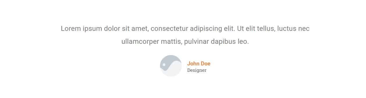
2. Testimonial Quotes
The most common and most popular form of testimony is to provide quotes from real customers.
This method takes up less space and less effort to collect information while still providing relatively the same effect.
Having real reviews from real customers helps your viewers feel more confident in giving you their business and trusting you to provide them with a high-quality product or service.
Remember that the biggest key to success within this section of your webpage is to use real customers and real reviews.
Elements that Should be Included in Your Social Proof
1. Partnered Brands
If you work with any other companies or have any brands that you’ve partnered with this is a great place to show them off.
Showing that you work with other credible businesses and brands helps confirm your own business’s authority.
This is especially effective if the partnered brands are popular enough to be recognized and trusted by your viewers.
2. High End Clients (with permission)
Any high-end or well-known clients can also be great to list with their approval.
This not only shows that clients trust you and think your end product is of good quality, it’s another way to link back to real life references and prove that your business is legit.
3. Social Media Links
Finally, you’ll want to include social media links.
It’s a no brainer to list out your own socials on your site, but it can also be helpful to link to the socials of any partnered brands or high-end clients given their permission.
Elements that Should be Included in The Offer
1. The Product
This one should be obvious, but you need to show your viewers what you’re actually offering!
Show your potential customers exactly what you’re selling and describe not only what it is but how it will help improve your customers’ lives.
If it’s a service, describe exactly what is included in the service and what your customers can expect to be provided with.
If your viewers have to guess at what you’re offering or what they’ll be getting for their purchase, they’re unlikely to follow through on the sale.
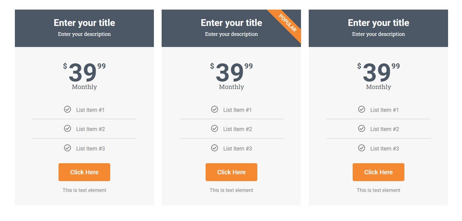
2. The Price
Along with your product or service, you need to list the price.
Transparency is key. No one wants to have to search for how much this is going to cost them, and hiding your prices only makes you look shady.
Be fully upfront about what your product or service costs and list out any pricing options you may have for different purchasing options.
3. Why Does the Customer Need this Product?
Now that your viewer knows what it is that you’re selling, it’s time to tell them why they need this in their lives.
How will this product help them? How will your service improve their life or their business?
Even if it seems obvious, list out the benefits clearly and concisely so that your viewers understand how your offer could change their lives for the better.
Let’s say you’re selling sunglasses.
Everyone knows that sunglasses help you see better in bright lights and protect your eyes from harmful rays. Restating these facts isn’t necessarily going to be your best-selling point.
Instead, focus on how your sunglasses filter out even more harmful rays than the competition, how stylish they are, or how durable and versatile they can be.
The more non-obvious benefits and features you can point out about your product, the more your viewers will be able to visualize how their lives would improve if they owned your product.
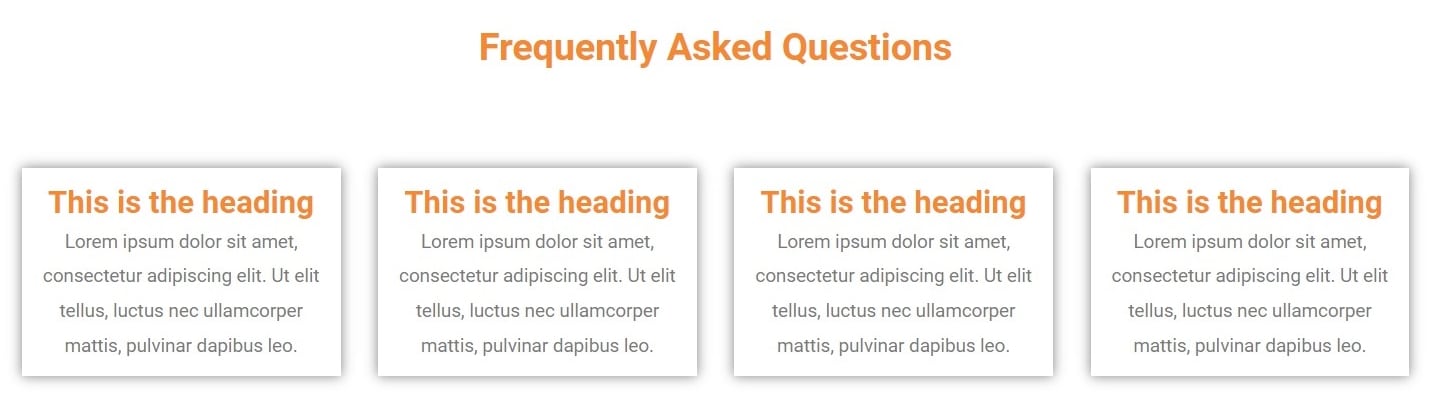
Elements that Should be Included in Your FAQs
1. Objections, Concerns, and Doubts
Once you’ve presented your viewer with your offer, it’s time to mitigate any concerns, doubts, or questions they may have about its legitimacy or efficacy.
Try to view your offer from an outside perspective and use common questions you’ve received from real customers in order to fully address any doubts or concerns your viewers may still have.
2. Address and Reassure Your Customers
Time to confront the possible negatives!
Take all of the questions you’ve come up with or have referenced from real customers that express any doubt, concern, or ask for clarity regarding your product.
Now answer them.
Yes, it’s really that simple.
Address any possible negativity regarding your product or service head on and explain why those possible doubts are not a concern with your product.
Tell your viewers how your product or service overcomes those issues and highlight any specific features that cancel out these doubts specifically.
For example, if someone is buying a coffee mug and is worried about the design coming off in the dishwasher, explain how your coffee mugs are designed specifically with longevity in mind in order to withstand years of repeated cycles in the dish washer.
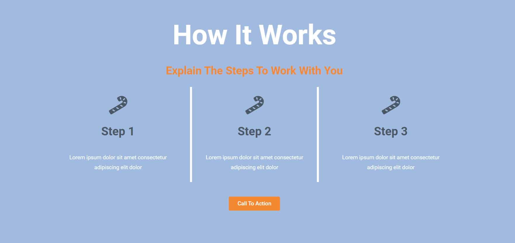
This is also a great section to go into greater detail about how your offer truly works.
Perhaps you run a law office, you could list out the exact steps a client would go through when reaching out to you for legal advice and explain how each of those steps would progress.
Viewers that feel informed and confident about the product are far more likely to make a purchase than individuals that still have questions or confusion surrounding the process.
3. Offer Clarity and Confidence
The most important thing to remember when creating your FAQs section is that clarity and transparency are key.
Consumers aren’t mindless, unintelligent beings. If you’re lying about your product, people will find out.
While you want to exude confidence and eliminate any possible doubts, it’s also crucial to stay truthful and let your product do the talking.
Final Call to Action
1. Your Logo and Business Name
Just like in your header, your logo and business name should be listed clearly in your footer. They don’t need to be huge or take up lots of space, but they should be clearly visible.
If applicable, you can also add affiliate logos and business names in your footer.
2. Terms and Policies
Your footer is a great place to add in links to any privacy policy pages, terms of service pages, or other innocuous legal documents that need to be listed on your site but will likely not be visited by many of your viewers.
This is also a great place to list out your more popular pages again or to list out the less popular pages that you didn’t want cluttering up your header menus.
3. Social Links
Social links are another great thing to relist in your footer.
After all, you can never have too many opportunities to link back to your own content and reroute viewers to other content within your brand.
We hope you’ve enjoyed this guide on what to include on your website’s homepage and that you now have a better understanding how to best format your webpage.
For additional help on this topic, or to learn more, please reach out to [email protected]